 This picture made me think of the art from the Digital age, mainly because it is constructed from type. The entire thing is chaotic, but we can still see a solid design in it. It reminded me of slide 70 in the digital age because they both had distinct figures that were completely made out of text. http://designm.ag/images/0609/textart/21.jpg
 This Prada add makes me think of Art Nouveau. The colors are muted and don’t show a lot of detail, and especially the background is clearly defined by black lines, while the features both of the model and the background mural are very abstract and not very detailed. This reminded me a little of slide 28 in the Art Nouveau age because the figure in the image is abstract, with few details, but is still concrete enough to have a distinct shape and outline. http://www.purseblog.com/images/prada-trembled-blossoms-bag.jpg
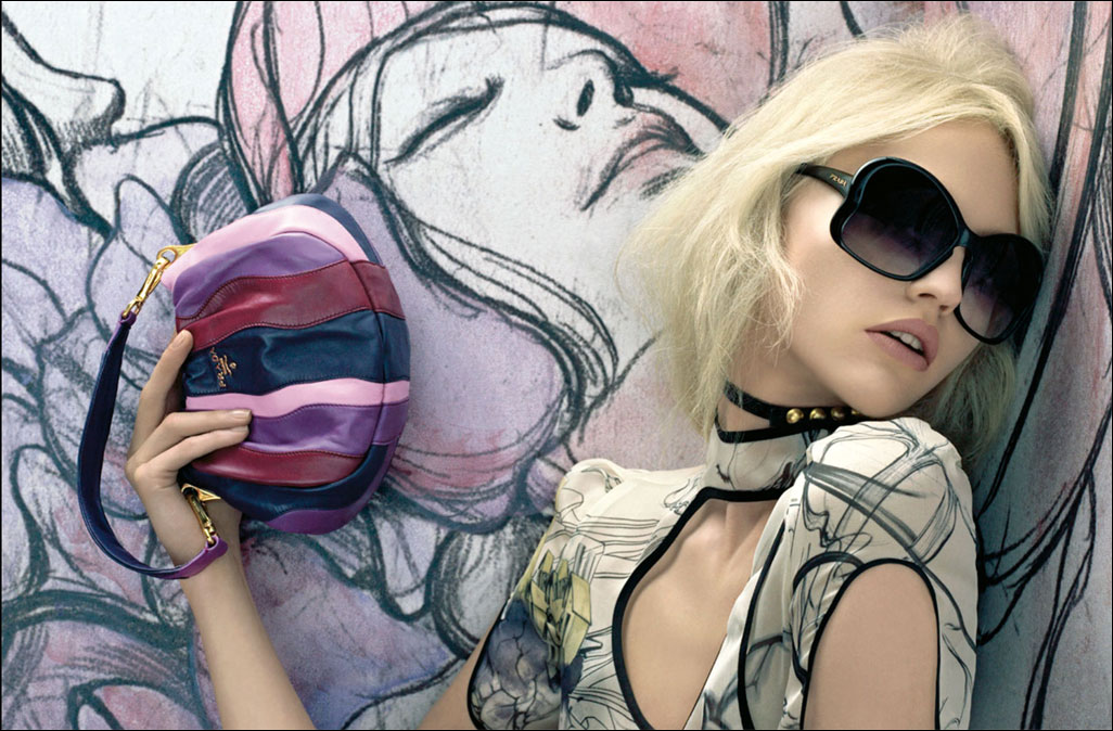

This chair from IKEA made me think of 1950’s art and design. The chair is similar to a wing-back chair from the 1950’s (slide 14 of American Kitsch). The chair has a dramatic curvilinear design, which was common of most designs in the 1950’s.
http://www.ikea.com/us/en/catalog/products/30139604
 The Juicy Couture logo instantly made me think of Victorian design. The type is ornate and romantic, while the ad itself is ornate, fancy, and definitely symmetrical. Although it isn’t as complex as some of the things from the Victorian age, it still has a lot of little complexities, especially in the crown. This reminds me most of slide 33 from the Victorian age, just because it is black and white but still has little complexities. http://thegfile.files.wordpress.com/2007/12/juicy-couture-logo.png

These Betsey Johnson ads make me think of psychedelic graphic design mainly because of the bright, contrasting colors and the curvy cartoonish design. These reminded me of slide 42 in the psychedelic age because of the bright colors and crazy design. http://hamptons.guestofaguest.com/wp-content/uploads/2008/07/betsey_redhead.jpg
No comments:
Post a Comment